
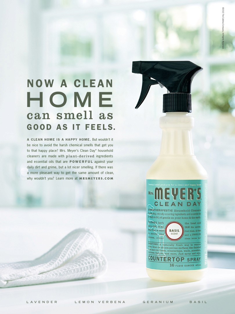
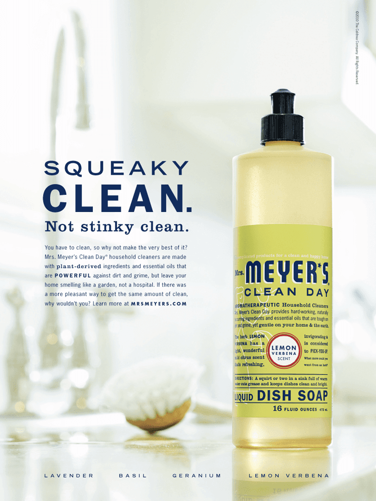
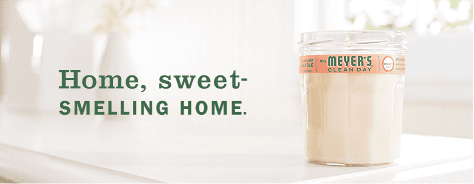
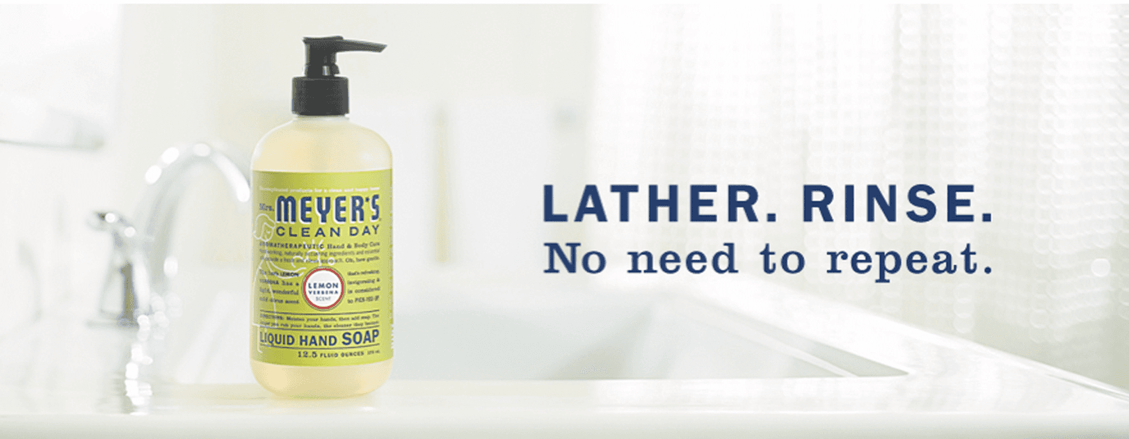
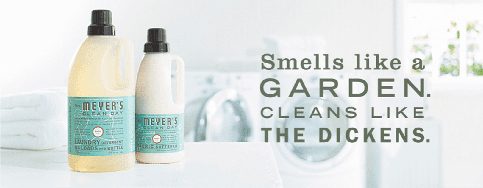
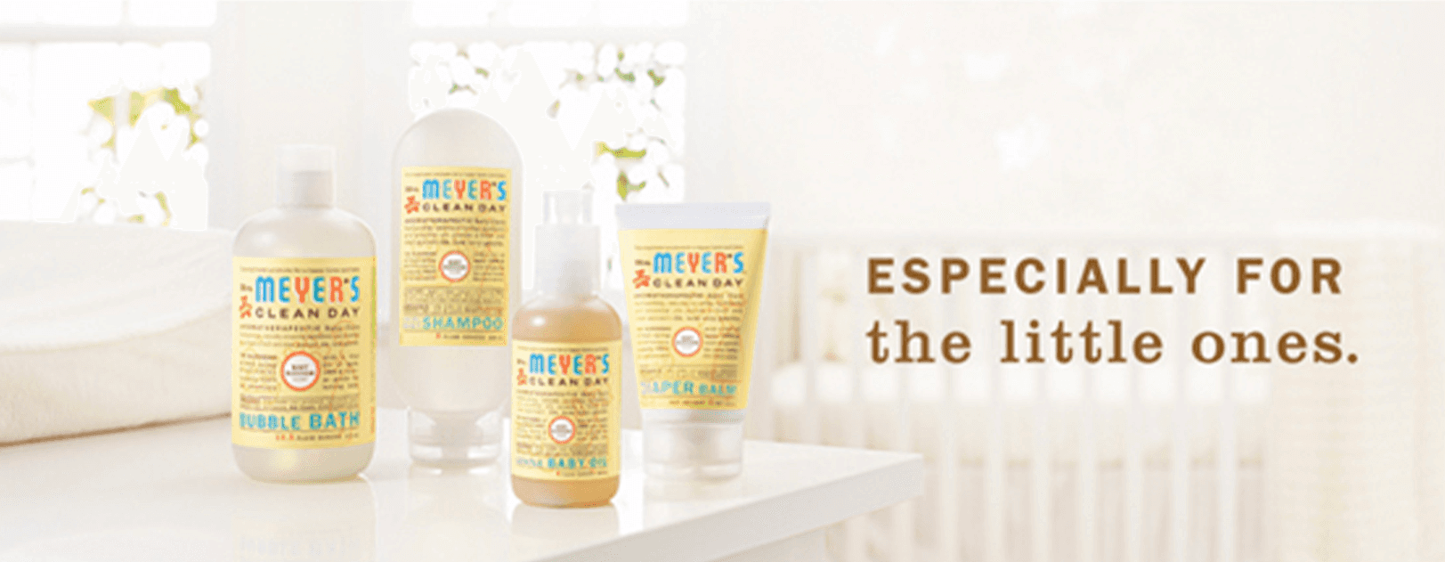
When Mrs. Meyer’s Clean Day was still a rising brand, the challenge was to bring its story to life in a way that felt as honest, approachable, and fresh as its products. The campaign embodied the brand’s essence: spreading goodness through thoughtful, beautiful cleaning solutions.
Children’s Health is the eighth-largest pediatric health care provider in the nation and a leading pediatric health care system in North Texas.
Over the years, Children’s Health has grown significantly from one hospital to a comprehensive system including three hospitals and more than 30 locations. The red balloon logo of Children’s Health is widely recognized in North Texas as a symbol of commitment to patient care and family trust.
The ‘Kids Rule’ campaign aimed to refresh the Children’s Health brand, ensuring it remains top of mind for parents making health care decisions. By celebrating the essence of childhood, the campaign emphasized the resilience and optimism of kids, positioning Children’s Health as the provider of choice for pediatric care.
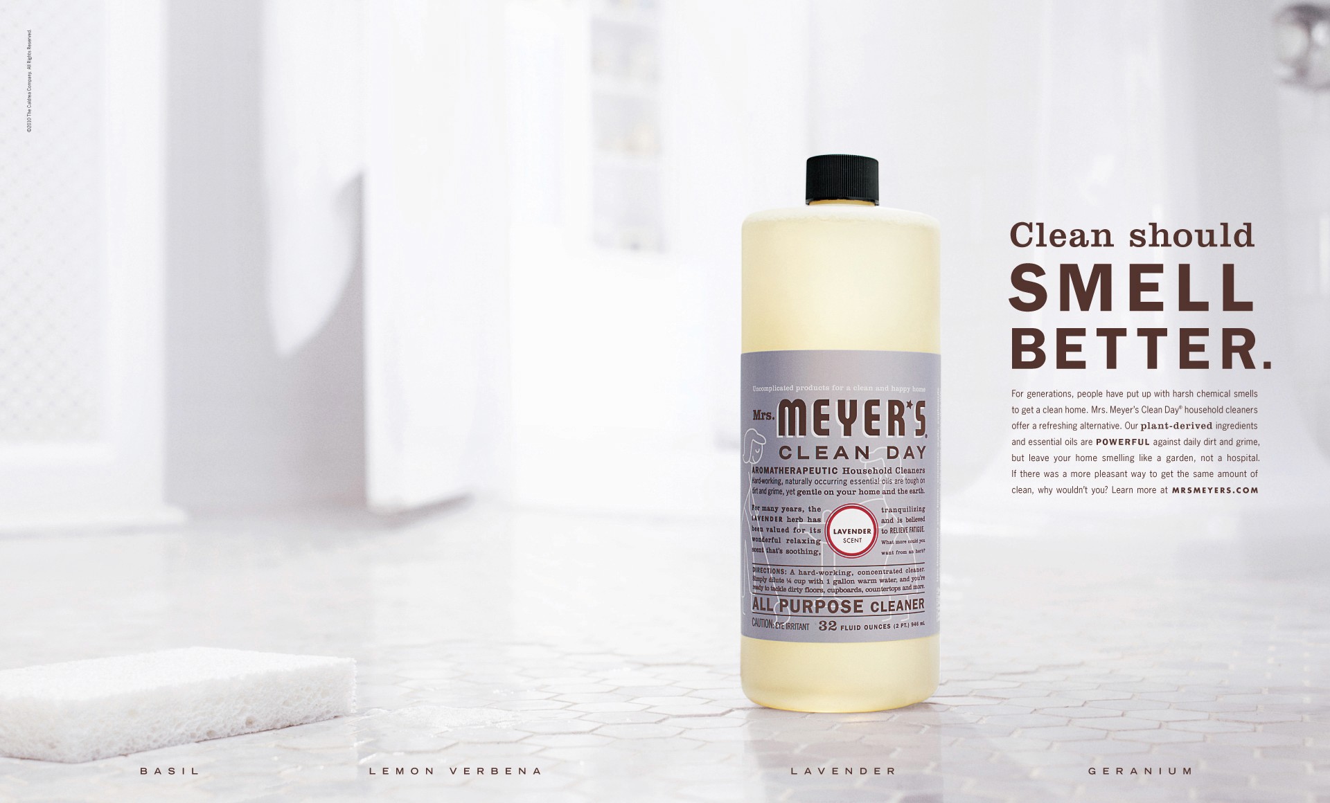
From typography to live experiences, every detail of this campaign was rooted in Mrs. Meyer’s values of simplicity, trust, and optimism. We created clean, hardworking visuals that extended the beauty of the packaging design while maintaining a soft, approachable feel. Headlines carried the warmth and practicality that define the brand’s voice, while the line-drawn details provided an extra layer of trust and care.
The work extended beyond traditional formats, including an imaginative event at San Francisco’s Ghirardelli Square that turned a fountain into a larger-than-life kitchen sink. This unexpected moment captured imaginations and brought the brand to life in a playful yet meaningful way, connecting directly with the audience and spreading the message that even the smallest acts—like cleaning—can make life a little better.
The campaign laid the foundation for Mrs. Meyer’s rise to household-name status, earning widespread recognition and a devoted following. More than a campaign, it became a demonstration of how thoughtful storytelling and design can elevate everyday products into something truly inspiring.
The campaign laid the foundation for Mrs. Meyer’s rise to household-name status, earning widespread recognition and a devoted following. More than a campaign, it became a demonstration of how thoughtful storytelling and design can elevate everyday products into something truly inspiring.
CCO: Chris Lange
CD: T. Scott Major
CW: Riley Kane
CCO: Laura Fegley
CW: Josh Gloe
Producer: Liz Wingate
Jake Carlsrud
Jake Carlsrud
© 2026

